
Post-Processing Gallery#
Table types#
Simple table (simple)#
This is the simplest type of table. No manipulation is made on the data. A sub-selection of the available columns can be made.
The following is an example of simple table used for the TIARA BC benchmark:
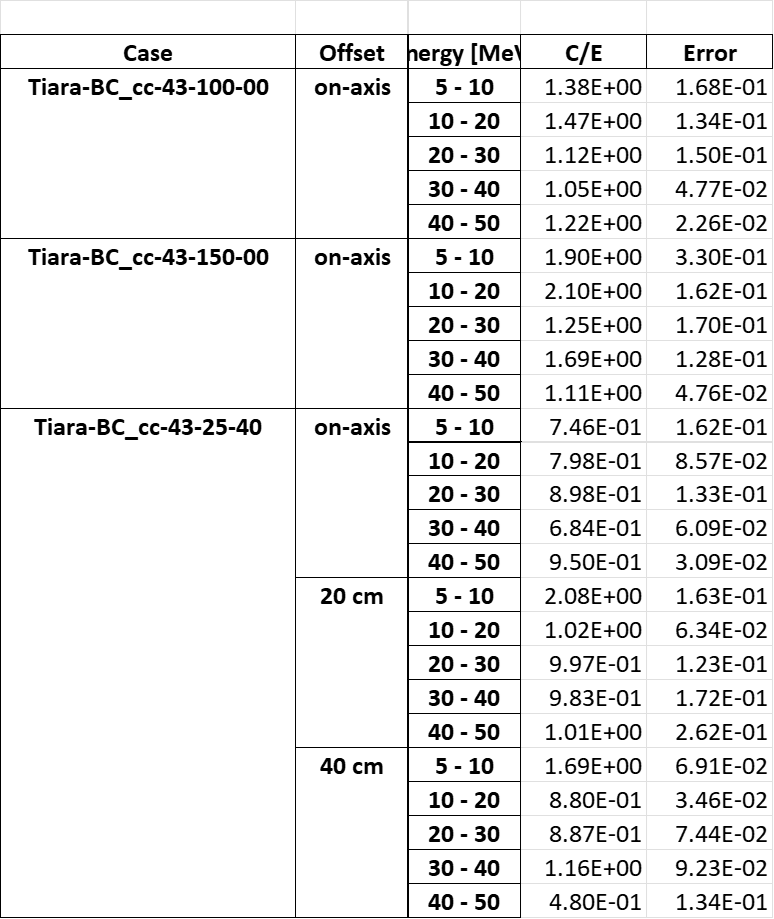
This is the kind of YAML configuration that can be used to produce this table:
Neutron yield:
  results:
    - Coarse neutron yield
  comparison_type: ratio
  table_type: simple
  x: ['Case', 'Offset', 'Energy']
  y: ['Value', 'Error']
  change_col_names: {'Energy': 'Energy [MeV]', 'Value': 'C/E'}
Chi-square table (chi_squared)#
This is a specific implementation of the simple table which is used to report the chi-square value of a C/E comparison.
The implemented formula is:
where N is the total number of bins.
The following is an example of the chi-square table used for the IPPE-DT benchmark:
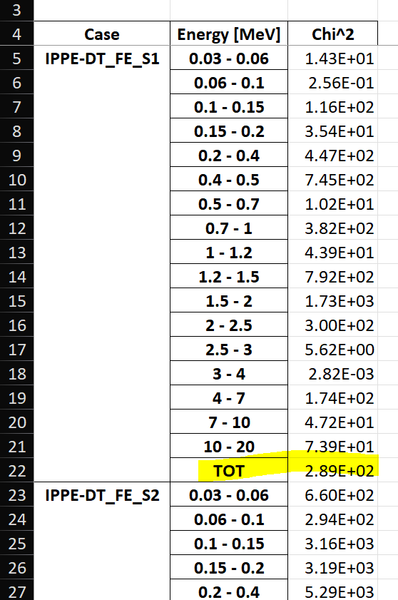
This is the kind of YAML configuration that can be used to produce this table:
Neutron flux (chi):
  results:
    - Coarse neutron flux time domain
  comparison_type: chi_squared
  table_type: chi_squared
  x: ['Case', 'Energy']
  y: ['Value']
  change_col_names: {'Energy': 'Energy [MeV]', 'Value': 'Chi^2'}
Pivot table (pivot)#
This works exactly like an excel simple table. The data is reshaped according to what is specified to be on the x-axis, the y-axis (which can be multi-index) and which column to use as values.
The following is an example of pivot table used for the Sphere leakage benchmark.
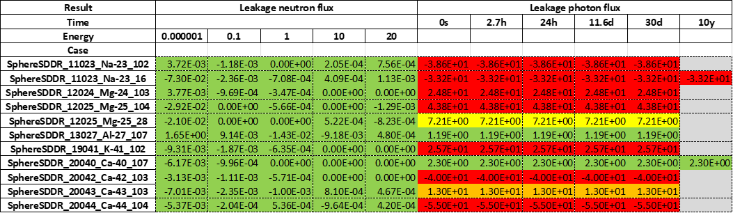
This is the kind of YAML configuration that can be used to produce this table:
comparison %:
  results:
    - Leakage neutron flux
    - Leakage photon flux
    - Neutron heating
    - Photon heating
    - T production
    - He ppm production
    - DPA production
  comparison_type: percentage
  table_type: pivot
  x: Case
  y: [Result, Energy]
  value: Value
  add_error: true
  conditional_formatting: {"red": 20, "orange": 10, "yellow": 5}
Plot types#
Binned plot (binned)#
This plot is often used for quantities that are binned in energy. The following is an example of binned plot used for the Sphere benchmark.
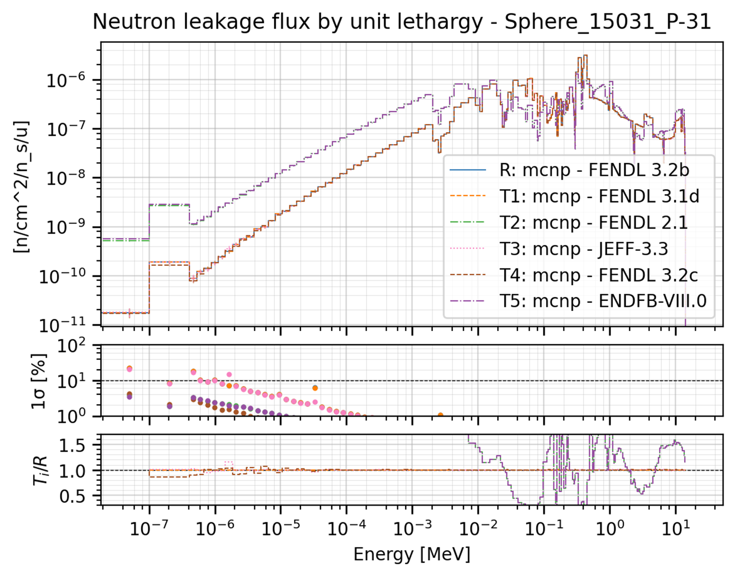
This plot can be produced by the the following YAML configuration:
Neutron Leakage flux:
  results:
    - Leakage neutron flux Vitamin-J 175
  plot_type: binned
  title: Neutron leakage flux by unit lethargy
  x_label: Energy [MeV]
  y_labels: '[n/cm^2/n_s/u]'
  x: Energy
  y: Value
  expand_runs: true
  plot_args:
    show_error: true
    show_CE: true
These are the extra plot_args that this type of plot can accept:
show_error: if True, an additional subplot is added that includes the statistical error associated to the plotted values.show_error: if True, an additional subplot is added that includes the statistical error associated to the plotted values.show_CE: if True, an additional subplot is added that includes the C/E values associated to the plotted values.subcases: a list of subcases to be plotted. The first value is the name of the column that identify the subcasese while the second value is a list of the subcases to be plotted. The different cases will be plotted all in the same subplot.scale_subcases: if true and subcases are present, it scale each subsequent subcase bu 1e-1 to fit them all in the same subplot. Default is false.xscale: The scale of the x-axis. Every argument that could be passed to the matplotlib functionset_xscale()is accepted. Common ones are ‘linear’ or ‘log’. Default is ‘log’.yscale: The scale of the y-axis. Every argument that could be passed to the matplotlib functionset_yscale()is accepted. Common ones are ‘linear’ or ‘log’. Default is ‘log’.
Ratio plot (ratio)#
Values are divided by the reference to get the ratio. The following is an example of ratio plot used for the ITER 1D benchmark.
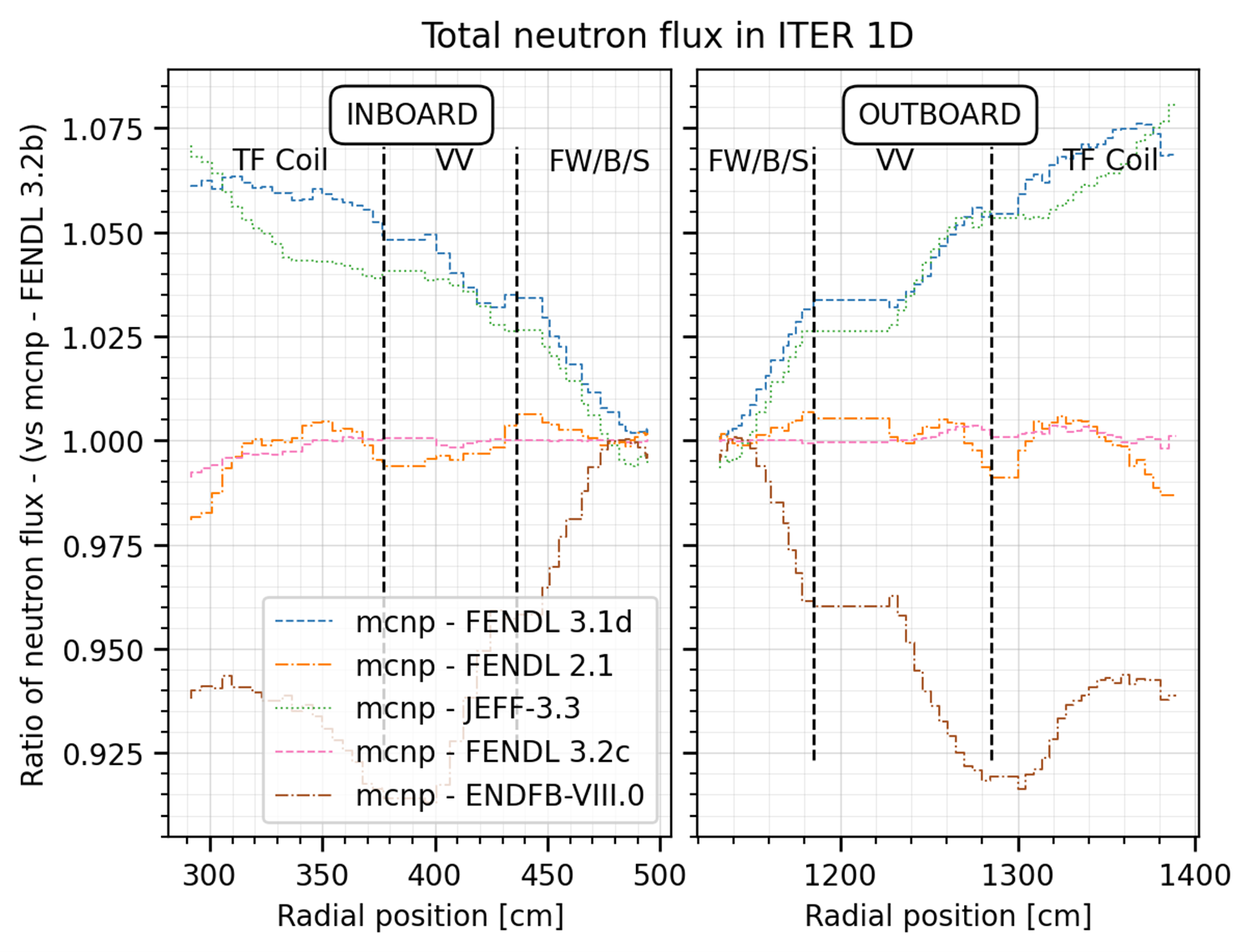
This plot can be produced by the the following YAML configuration:
# Some aliases as they are used in all the plots
_additional_labels: &lables
# the x coordinate indicates the left start of the label
major: [["INBOARD", 360], ["OUTBOARD", 1210]]
minor: [
    ["TF Coil", 310],
    ["VV", 400],
    ["FW/B/S", 450],
    ["FW/B/S", 1125],
    ["VV", 1220],
    ["TF Coil", 1325]
]
_v_lines: &lines
  minor: [377, 436, 506.6, 1115, 1185, 1285]
_split_x: &split_x
  - 526
  - 1095
#
Total Neutron flux:
  results:
    - Total neutron flux
  plot_type: ratio
  title: Total neutron flux in ITER 1D
  x_label: Radial position [cm]
  y_labels: neutron flux
  x: Cells
  y: Value
  expand_runs: false
  additional_labels: *lables
  v_lines: *lines
  plot_args:
    split_x: *split_x
These are the extra plot_args that this type of plot can accept:
split_x: if True, the x-axis is split in two parts. This is useful if a portion of the x-axis results are not interesting and need to be omitted. It is a tuple/list of two values. The first value is interpreted as the x max limit of the left subplot while the second value is interpreted as the x min limit of the right subplot.
C/E plot (ce)#
Similar to a ratio plot is spirit but more useful when the x-axis is categorical and discrete. The following is an example of C/E plot used for the TIARA BC benchmark.
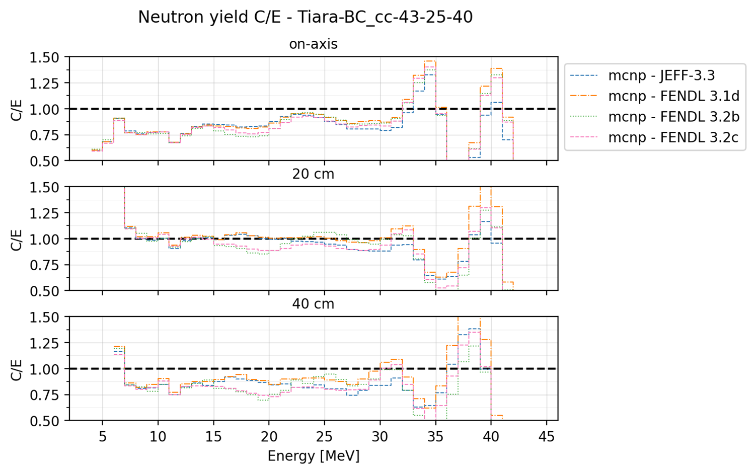
This plot can be produced by the the following YAML configuration:
C/E plots:
  results:
    - Neutron yield
  plot_type: ce
  title: Neutron yield C/E
  x_label: Energy [MeV]
  y_labels: 'dummy'
  x: Energy
  y: Value
  expand_runs: true
  plot_args:
    subcases: ["Offset", ['on-axis', '20 cm', '40 cm']]
    style: 'step'
    ce_limits: [0.5, 1.5]
These are the extra plot_args that this type of plot can accept:
style: either ‘step’ or ‘point’. If ‘step’, the plot is a step plot. If ‘point’, the plot is a scatter plot.ce_limits: define a minimum and maximum limit for the C/E plot. The first value is interpreted as the y min limit of the plot while the second value is interpreted as the y max limit of the plot. Triangles are plotted on the limit line in case the data exceeds it.subcases: a list of subcases to be plotted. The first value is the name of the column that identify the subcasese while the second value is a list of the subcases to be plotted. This will cause the plot to be split in as many rows as the number of subcases.shorten_x_name: this type of plots can be categorical. In the event of using the cases as x axis, the long names of the benchmark runs can become problematic. This option will split the name of the benchmark run on the ‘_’ symbols and retain only the last N chunks where N is the specified shorten_x_name value.rotate_ticksif set to True, the x-axis ticks are rotated by 45 degrees. default is False.xscale: The scale of the x-axis. Every argument that could be passed to the matplotlib functionset_xscale()is accepted. Common ones are ‘linear’ or ‘log’. Default is ‘linear’.shorten_x_name: this type of plots are often categorical. In the event of using the cases as x axis, the long names of the benchmark runs can become problematic. This option will split the name of the benchmark run on the ‘_’ symbols and retain only the last N chunks where N is the specified shorten_x_name value.
Barplot (barplot)#
Categorical x-axis, values are plottes as grouped histogram bars. The following is an example of barplot used for the ITER Cylinder SDDR benchmark.
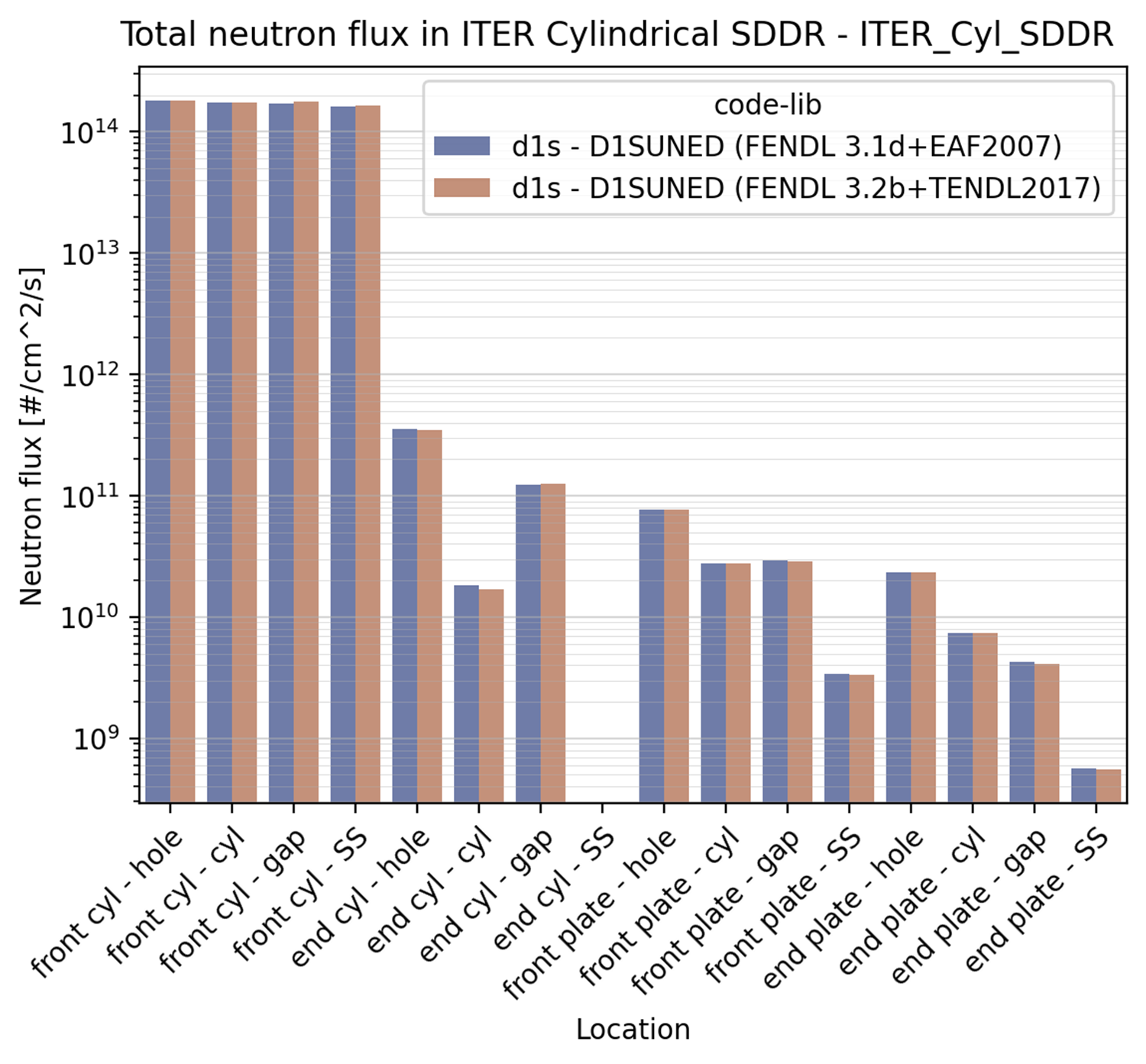
This plot can be produced by the the following YAML configuration:
Neutron flux:
  results:
    - Total neutron flux
  plot_type: barplot
  title: Total neutron flux in ITER Cylindrical SDDR
  x_label: Location
  y_labels: Neutron flux [#/cm^2/s]
  x: Cells-Segments
  y: Value
  plot_args:
    log: true
These are the extra plot_args that this type of plot can accept:
max_groups: indicates the maximum number of values that are plotted in a single row (to avoid overcrowding). by default it is set to 20.log: if True, the y-axis is set to log scale. Default is False. The code also analyses the data to be plotted and if the values span in less than 2 order of magnitude the log scale is not applied.shorten_x_name: this type of plots are often categorical. In the event of using the
cases as x axis, the long names of the benchmark runs can become problematic. This option will split the name of the benchmark run on the ‘_’ symbols and retain only the last N chunks where N is the specified shorten_x_name value.
Waves plot (waves)#
This is an example of the wave plot used for the SphereSDDR benchmark.
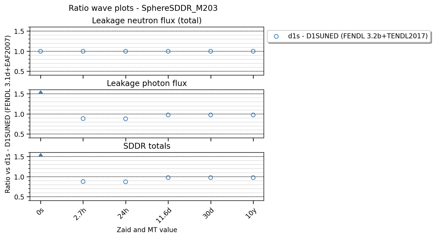
This plot can be produced by the the following YAML configuration:
Wave plots (Materials):
  results:
    - Leakage neutron flux (total)
    - Leakage photon flux
    - SDDR totals
  plot_type: waves
  title: Ratio wave plots
  x_label: Zaid and MT value
  y_labels: ''
  x: Time
  y: Value
  expand_runs: true
  plot_args:
    limits: [0.5, 1.5]
  select_runs: SphereSDDR_M\d+
These are the extra plot_args that this type of plot can accept:
limits: a tuple of two values that define the limits of the plot. The first value is the y min limit while the second value is the y max limit.shorten_x_name: this type of plots are often categorical. In the event of using the cases as x axis, the long names of the benchmark runs can become problematic. This option will split the name of the benchmark run on the ‘_’ symbols and retain only the last N chunks where N is the specified shorten_x_name value.